Wednesday 13 April 2011

Evaulation

 
In what way does your media product use Conventions of real media products?
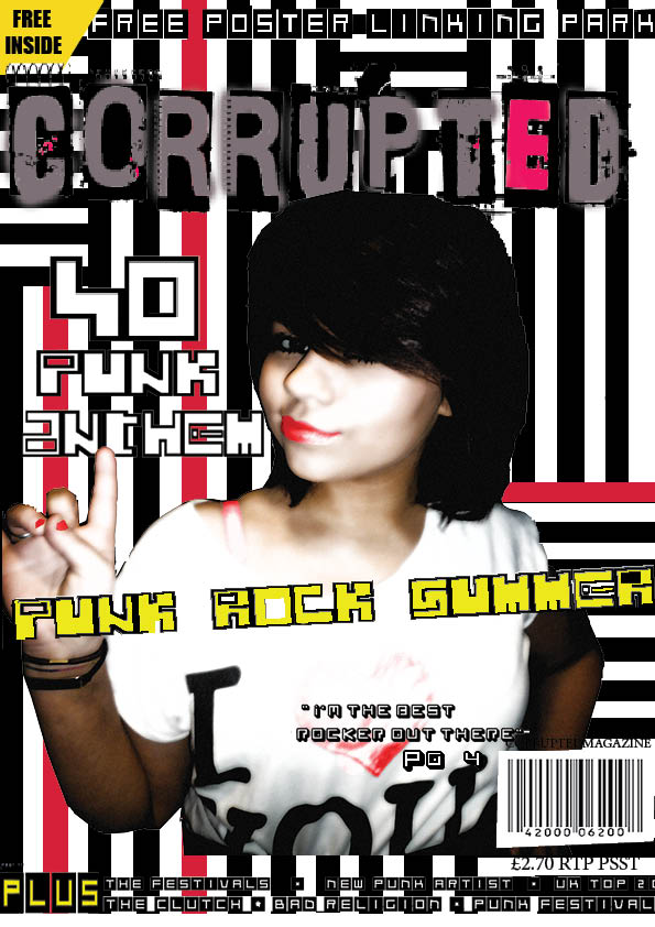
For my music magazine my main aim was to produce my a product that look liked it can fit well with the industry i wanted it to look very professional and look appealing enough that it would be worth buying with money. For me to achieve this i had to add various distinctive features of a music magazine that would be present in a normal magazine. This included Masthead, Cover lines, Central Image, Main Cover line in my magazine; I have used my feature which is conventional to magazine. I have placed my masthead at the top f the page, my detailed positioning of my features would end up producing a very believable music magazine I also have a number of cover lines and a central image which i fought would be attractive and most appropriate my image suited the genre of my music magazine. My main cover line is in a different colour and larger font, in comparison to the other text. Other features of my magazine that challenges the forms and conventions of music magazines. For example, for my background, I have used black striped lines with the occasional red. the colour scheme help me to link it back to my main imagine and mad the music magazine more eye catching and eye appealing This was to make the cover appear more authentic it made my music magazine more unique because usually other designer would either go for the safe look of the magazine with the plain background but my background represented the vibrant ness
 Of the music. It would have been difficult for me to create the kind of background I would have wanted.  In the magazine "distorted" the colour pink is used as a theme though out all issue of the magazine and is used in the title and borderlines of the magazine, I tried to portray this same technique in the image and back ground and various small parts of the title.  The name ‘distorted’ lets the readers know what sort of magazine it is. I tried to use similar techniques with my magazine title 'corrupted sound' to have the effect of punk rock magazines. Corrupted sound gives a sense of vibration and eruption which I believe represents the genre of the music. the title of the magazine always give the genre so I believe it important to make sure the title  is clear and in a way stereotypical in order to bring the correct readers
The font I decided to use was influenced by the magazine "distorted", distorted magazine master head letter are displaced and arrange in a muddled order I try to do the same with corrupted sound. the title corrupted looks a bit corrupted and ragged I have chosen to used display my magazine title in grey with hints of red. I used this to help 
Represent my title with the genre of the magazine
The written content on the front cover are conventionally keep to a minimum, in order to draw more attention to the images, as well as to avoid the page from appearing too clustered. The featured written content is in the form a cover line, which relate to other articles within the magazine. There may also be the use of puffs, to appeal to the reader, and a strap line. In this sense, I have adopted many of the convention found in music magazines, as I have used these features. Music genre and how your magazine suggests the manner in which the magazine portrays it musical genre can be achieved through various features. In "distorted", the use of a title with rock music connotations, as well as an artist like ‘’ would provide indications as to the genre. This is similar to Glam rock magazine‘’, where the artist, and his fame in a specific musical genre would suggest its genre. As I am unable to employ the use of internationally acclaimed artist, I have to use other methods. E.g. vibrant colours and distinctive headlines

How does your media product represent particular social groups


my main imagine is of a female girl called Daniela her pose is a dominate ideology of how punk rock people may act which is free will and spirited he pose with her fingers show an act of rebel and punk rock music which is rebellious. below is a video of how music is preformed .although Daniela who is a female is used to represent the social group punk rock is defined by gender but just purely for the like of rebellious behaviour.
The models style and dress sense are stereotypically designed to fit in with the rock genre which will also attract the target audience as it may reflect their own image. They will also be influenced and inspired by these artists styles as most youths are interested in being ‘cool’ and fashionable. Use of informal and taboo language enabled my magazine to relate to my target audience of teenagers and young people.


What kind of media institution might distribute your media product and why?


I think that my magazine would be best suited to an independent publisher I think this because during the course of my work I have been trying to relate to punk ideologies (mentioning independent music labels/unsigned acts my magazine will be relating to the genre; alternative clothing stores, popular venues, music channels. My magazine should be distributed at music gig venues and also it should be available on line
Where the reader can gain extra access to the magazine and then become interactive by commenting and feel like they have an input in the music magazine The Shadow could be promoted online through You tube with exclusive content such as teaser trailers or scenes from the film. Also promoting my music magazine Social Networking sites such as Face book and my space could be used to create pages and groups for fans of the magazine which would create discussions and therefore more publicity to my music magazine through media institutions
My magazine could be distributed by the institution ‘IPC’ as this published ‘NME’ magazine which I based my magazine on because its rock. As the music genre I have chosen to base my magazine on is one of the biggest in the music industry, it would be sold in local newsagents as well as large supermarkets where other types of magazines are sold, as it targets such a wide ranged audience. ‘IPC’ has already successfully published ‘NME’ magazine therefore I believe that my magazine would also be successful as it is the same.
i would also consider EMAP for distributing my magazine as both companies are special interest magazine publishers, specialising in more my market


What would be the audience for your media product?
My magazine is intended to be aimed to appeal to my primary audience of age 16-25 year old females and males. The female target audience would; may be able to relate to the magazine picture and aspire to be her but for boys the main image could be appealing to them for that being there ideal girlfriend. There are many different ways the magazine can appeal to the social groups because it’s diverse.

in different magazine including nme they use the same techniques in order to appeal to both audiences at the same time. for example in nme the immage belows is of rihanna she look strong and independant. women of the magazine readers may look toward he as aspiring and and good inspriation . but ti also can appeal to men by her looking very attractive and seductive it may intrest the reader


i also did some reach and gave this quesstin to the public on in brixton asking what age group do you think punk rcok appeals tp. the results are on the pie chart above. many agred that punk rock is mainly for people aged around 16-24 with majourity of the votes.

Also the pricing of the music magazine attractive to the targeted audience because it is not to expensive. It primary audience is 16-25 this audiences are likely to be students. Therefore the pricing must be reasonable because they maybe be less likely to purchase if it is unreasonable. My magazine could also attract more of a
Mature older audience who may be interested in rock/indeed music due to informal and taboo language used with in the double page spread, also, they can relate to their style/personality through use of the mise-en-scene such as costume used to represent her style and stereotype of being individual and alternative


How did you attract/address your audience?


Mise-en-scene of image in my front cover was a stereotype of what I fought look like genre of punk rock music I have tried to incorporate vibrant clothing and lipsticks crazy hair and awkward poses. Let will be more recognisable to the readers of this genre in music. my choice in costumes and props is crucial on the front cover, when attempting to convey an intended image but I keep imagine at a reasonable level of attention so that the articles will still be relevant to the reader ‘distorted’ features their main cover artist singing passionately in to the mice it also a middle shot his attitude shows punk rock including his tattoos on his arms another form of stereotypes. I have adopted the technique portrayed in corrupted sound; using a medium shot the image also brings strength of attitude. I have did use props but I used props in my content page.  But in my research of analysing other music magazines there was not a prop of Guitar present. This may be because the magazine is well known or the person on the front cover is known for being the singer or an icon of music, this is how I wanted to betray my music magazine. For my questionnaire I realised that the image is most important if you want to attract the audience. It ahs to be appealing a relate the targeted audience in order for the magazine to be bought.


What have you learnt about technologies from the process of constructing this product?


I feel as though I have learnt a particularly wide range of skills from the process of creating my music magazine. I used ‘Adobe Photoshop’, "In design" and ‘Paint’ throughout my process. I have learnt how to edit and refine photographs in Photoshop by changing the contrast to get the correct lighting effect to fit my colour scheme. How to edit out parts of scenery that was not needed or affected the quality of my photo. I learnt all of the main elements on "in design" which greatly enabled me to create my media product. I also used publisher to do my ICT drafts. I used http://www.dafont.com/ to get an eye catching font that would attract attention and gave my title that corrupted look.. Paint helped me edit this font by being able to crop it so no white edges could be seen. It was also easy to use as I only had to copy and paste this from paint to Photoshop and then to in design. I also noticed that colour scheme and font style can make or break the magazine the font could not look armature and the arrangement of the magazine were also important. They played a massive role in terms of making my music magazine and I experimented with different types and styles to see which the best look until I came to a final decision. Without learning these technological skills I would not have achieved the professional finish


7. Looking back at your preliminary task the school magazine, what do you feel you have learnt in the progression from it to the full product?
I have mainly learnt it’s important to plan and understand ho your targeted audience is. with that clear conception you will be able to proceed in success because you know you audience what they like and what is need this lead me on to learning more about mise-en-scene of a magazine and the effect it can have on an audience how simple things like prop and design can make an major effect on a music magazine and your genre. I also learnt that it is important to continue a theme throughout the magazine by using the same colour scheme and fonts throughout like the prelimary task. From the time of making the preliminary task I developed my skills at Photoshop, learning more advanced skills in the process of the next few weeks. This enable me to make my magazine in a quick and more efficient way the time taken on my preliminary task.

FeedBack


Front Cover Final


My Final Front cover was  a big change compared to my previuos draft. everthing is now more put together and cleaned cut. text became more readerable and personally was more attrative. in my first draft i did not follow the convetions of usually music magazines. but aftet i studied how music magazine and front covers are emant to look i changed it immediatly. in my first draft there was the background was of strip whcih i fought was apporiate because i believed it repsented punk rock and stood out. but afetr  a while and through feedback i relised the lines made it difficult to read the music magazine. form other magazine i studied the attetion wasput on the model rather than the abckground. In my first draft i did the opposite way. so i changed this in my final draft and made my model have more attetion. with a more plain background.

The text in my Front cover is now more eader able and the image is anchor more easilt. in my first draft it was not clear why the image was there of what was the main story. in my studying of music magazine i noticed tehy emphasis on the front image on being there main article. So  i Emphasied the image of my final draft making it more appeealign to the the readers. i enlarged her nake to countinue that music magazine convetional effect,

Final- Redraft Content Page


I believe there was an major imporvemnt from my first draft magazine andfinal draft. fistly with the image. although in my first draft the image was quite clear, the image did not  relate to the punk rock genre i was going. by changing my imagine to a model, with pink hair, pierced tongue it look more punk rock to me. Also by me changing the the image i was able to bring relation from the front cover t the content page to the double page spread. the model was able to advertise herself in the way a magazine would. the new imagine in my final draft is very sharp and effctive and represent punk rock.

in my first draft there was not alot of text on my content page. but in my fnal draft i increased the text and gave a more clearer form. the links between each sentence was made more clearer and bold, like conent page shoul look. i saw this through the anaylsis of other music maagzine i studied. my final draft was simple yet had alot of information with the side bar including gigs to festiva and clubs which i believed the reader would enjoy.


My Final Re-drafted Double Page Spread Magazine


This is my final idea for my double page spread. I changed the main image to give it more meaning to the article she is now in a pose saying "oops" and the picture then anchors that. I've also included more text and made it more readerable. I follow through form the content page and front cover page colour scheme. the image is clearer and sharper. it has more mening

the Zebra background also brings the punk rock convention. I used the same article throughout all the double pages (of an interview) which presents an formal & normal view of the magazine and of the Kizz.the reason for me deciding to use the final draft because the large imagine and very versitle background. I wasn't sure how to fill the spaces in and after debating and experimenting with some Text, decided it This Version would work work.

First Draft Double page spread


these images were my first draft of my music magazine double page spread. I
have based this plan of my double page spread on real spreads from popular magazines. My design will have a large picture covering the entire left page, which follows the conventions of this text. ‘Supporting pictures’ of the celbretie hersef "lady Dada".

The colour scheme will come from colours used on my front cover and contents page, and also from the picture itself. my model AKA Lady dad wore colours that would relate the the background and text of the double page spread like the article with lilly alen. a simple  background will be used as the background for both pages, as this is the background colour of the picture that will be used, and fits previous colours.

the Text will be arranged into three vertical columns next to each other. This makes the text easier for readers to follow. it also how layout are used in real music magazines as i have researched before. Certain quotes or important words will be made bigger. and the models name would be emphasied

Doubl page spread Analysis

In this article, the artist is again taking up a full page of one of the double page spread she is the central imagw. She is dressed casually but her hair and eye make uo is very dramatic and loud which makes up for her casual clothes. the image representation could resemble she may look calm but really is not. the picrue achors the text. Her stance is quite challenging which could connect to the title of the article as she is stood with her hands on hips, suggesting she is being quite defensive. The title is on black cut out ragged slabs. this represent teh genre of hard, punk rock. It takes up most of the page, and some of the second page, to attract readers to the article. A consistent font is used but the letters vary in height; the title is also a quote from the artist which is explained later on by the sub-heading.lilly allen artist is made to stand out in red, which could have been used to tie in with the colour of her shirt.


his is a double page spread of Kerrang with an exclusive interview of the band “My Chemical Romance”There is a large picture on the left side page of the mazgazine which seems to be quite common on double page spreads. The pictures have a black and white theme which is seen throughout the double page spread.th magazine title ares blood and folow a solid and hard colour scheme. The words “the best MCR” are highlighted as being bigger and bolder this helps to bring importance the anchoring the imaging.The style of writing is informal which suits the rest of the magazine as being a rock magazine. The beggining has a large highlighted ‘M’ on signifying where the beggining of the text is and makes it easier for the readers to find the article and read it.There is a qhirw sidebar on the right of the page with more inormation. although its white it does not bring away attetion from the main image and purpose of the magazine.I could use aspects of this in my magazine.


First Draft content page Analysis 1


. i designed this brief outline of what the basic idea will be. More details will be added as I start work.

This contents page meets many of the rock music magazine conventions. Firstly, there is going to be a large poster-like picture. Secondly, there will be a minimal range of colours and fonts, however the ones that are used will be the same or very similar to those used on the front cover. The layout is also very conventional, with a large picture, and many relevant pictures, but more text eventually, explianing the articles in this issue.

My content follows forms and conventions of a music magazine content page showing clearly, page numbers, articles displayed on the front cover and other images featured in the magazine along with articles. it does link back to my my main content page and front cover. the colour scehme follows through, of hot pink. its eye cztching and the stroyline anchor the front cover image which brings the reader into reading the magazine. my representation of punkrock also help to link the front cover and content page. this is my first draft and i believed i had achieved most vital area of the maagzine in order oo it to agin the proffestional look.


Tuesday 12 April 2011

First Draft Content page


these are the images used in the content page:


Content page analysis

div id="__ss_7471311" style="width: 425px;">
Content page anayisis
View more presentations from nsasu94.

First draft of My Front cover


here are the pictures I originally shot for my front cover

Daniela pict
View more presentations from nsasu94

these images were edited to give the full effect and sharp effect of what a music magazine would.  i have re-edited these pictures to enhance colour and bring emphasis. in the photo in the pink i cropped out area not needed  which would not go well with the mise -en-scene. these effect and the the strength of the punk rock image I'm trying to portray. in the black and white photo only major sections in the pictured are coloured helping to bring more emphasis

Front Conver Plan


Questionaire & How my magazine will be distributed

Frequency: twice a week

Cover price:2:50

Publisher:cheese magazine 

Unique Selling Point: Free poster and discounts

below I designed a questionnaire to distributed in order to help me come to the conclusion for my magazine with things like frequency and cover price. below is a video of some of my recorded result and below is a sample of my questionnaire and why i  choose the questions


1.How old are you?
This help me to determine what my main Targeted audience 
Would be in order to gain most profit to the appealing audience

2. How often would you like to receive your music magazine?
I asked this question because i think its appropriate to know
 how often a magazine is likely to be distributed so you can 
recognise how much information should be given


3. What price would you like This magazine?
This magazine will help configure the pricing of the magazine. 
The price needs to be of a reasonable amount so my target
 audience will be willing to buy it, this question will determine that price.

4. Knowing it is a punk Rock magazine would you buy it?
this can help me recognize if there is a gap in the market for the genre punk rock and if the audience will be more interested

5.From these three option what would make you buy this music magazine: price , interviews or inspiration
his will determine if my target audience would like
 the magazine to be purely about music or include 
other things that they are interested in.

6.In your in opinion what would you be expecting from the magazine
i asked this question to consider what other aspect the audience 
would be deciding on in the deciding factor of if they buy the 
magazine or not. the question help come to a conclusion that 
extra little things like freebies would help improve the readership 
of the magazine

7. does the colour pink represent punk rock
this question would help me with my design of the music magazine
 in seeing whether colour is important and how colour will be portrayed
 on a punk rock magazine

8. is punk punk rock feminim,  masculine or both
this question helps me to decide whether
 to aim my magazine at both genders or just one. 

Below is a video of a few people answering my Questionaire.

Focus group

Names: victoria 
Age 16
Favourite Genre: Rock
Favourite Artists/Bands:  Florence and the Machine 
Music Consumption: Computer


Names: Daniela Simones

Age: 17
Favourite genre: Indie
Favourite Artist/Band: none
Music Consumption: computer, Blackberry, Ipod and Tv


Names: Shannon massey
Age: 16
Favourite Gene: rock, Techno
Favourite artist/band: Mechanicas
Music Consumption: Tv Channels


et
Names: Wendy Tetteh
Age: 16
Favourite Genre: HipHop, RnB & Metal rock
Favourite artist/band: Mechanicas
Music Consumption: Tv Channels


this is images and some background on my intended audience

Paramore Analysis Genre

Paramore front cover analysis
View more presentations from nsasu94.

Cheese magazine front cover analysis

  • The title cheese magazine,  is in capitals letters making it bold and  very visible and vibrant to the readers and is also very large making the magazine cover eye-catching. The colour of "cheese" is a dark but still noticeable.  it can suggests  the audience can varies to both genders because the colour is neutral. the cheese seem's bit destroyed which suits the genre of the music.


  • This is the main image of a rock star. He has been edited   to come across as perfect and flawless, faultless and natural, this will attract and appeal to  more women for the simple reason of finding him attractive and good-looking. The image also appeals to  boys as they may want to aspire and be like him, also rock music has no gender. it's not male or female.the imagine covers the main title showing  that the magazine is well known and the tittle does not need to be shown or displayed fully. the audience should automatically known which magazine it is. this show that the design is different and unique. the picture is rebel like with man with a blade in his mouth. his eyes are red as though posses which i believe suit the genre of the music.


  • "bullet for my valentine" the colour is white and red which causes the story to stand-out and separate it from other on-goings on the cover. The words stand out so vibrantly that you can see  it's the main story of the magazine making it most important but still not driving attention  away from the main image or title.


  • the colour scheme. there is 4 main colours, red white yellow and black. there are used in very different ways. the yellow seem to be used in the less important parts of the magazine to bring more attention to it. the main background is red. this is still a strong colour which can be represented for the punk rock genre which could be blood or power.


  • other promotions which help to attract more readers are the free poster. the sentence starts of with white and then in yellow says "free poster". this is done distinctively and brings importance because the way the colour scheme is done.
  • Choosen genre of my music magazine

    Punk rock is a rock music genre that developed between 1974 and 1976 in the United States, the United Kingdom, and Australia. Rooted in garage rock and other forms of what is now known as protopunk music, punk rock bands eschewed the perceived excesses of mainstream 1970s rock. They created fast, hard-edged music, typically with short songs, stripped-down instrumentation, and often political, anti-establishment lyrics. Punk embraces a DIY ethic, with many bands self-producing their recordings and distributing them through informal channels.


    the genre of my music magazine is Punk rock.

    my chosen title was Corrupted sound because I believe that the word corrupted is the embodiment of what punk rock music is. When you think of the word corrupted you may imagine cracks, raged, ripped. And punk rock represent all these things. Punk rock is unique and different in sound in which people may refer it as corrupted. i analysed different front cover magazine below to help come to my conclusion of my punk rock magazine name. other magazine tittles are loud and loud for example cheese magazine

    Feed Back of My Prelimary Task

    "The background was plain and boring it had no depth to it. It looks more like a newspaper” so I change the back ground to blue and increased the colour of the title by making it a rainbow colour.
    “Be more focus on the titles” I had numerous amounts which I could not decide on which to pick which wasted time . I had to find something more appropriate and meaningful like chameleon which meant people changing life’s like chameleons changing colours
    "Very nice and bright" the Blue was appealing to both Female and male audiences

    "the tittle is colourful and seems quite meaning for" I tired to bring meaning to the school magazine because i believe that is what will catch the readers eye. so i carefully conveyed ut un order to receive more audience

    What I believed would have helped me to improve my task is to have research into photo shop and indeisgn more. understand the tools and become more adaptive. this would help me to achieve the highest possible stand of work and help me to know the functions more.My main improvement was magic wand. I had to learn how alter between selection of the picture which gave it a high definition finish.

    Finished task of front cover of Prelimary

    žThe storylines I put in my school magazine Is what I felt would be appropriate. I used attractive storylines like facebook which is a big attraction  for teenagers around 16+. the storyline can help for the readers/audience to gain more information about themselves and the articles cover where suitable to attract my targeted audience. the story lines were also beneficial to them I had a mixture of serious storylines like, Public school vs. private school, and trivial storylines like agony aunt. below is an example


    Trivial